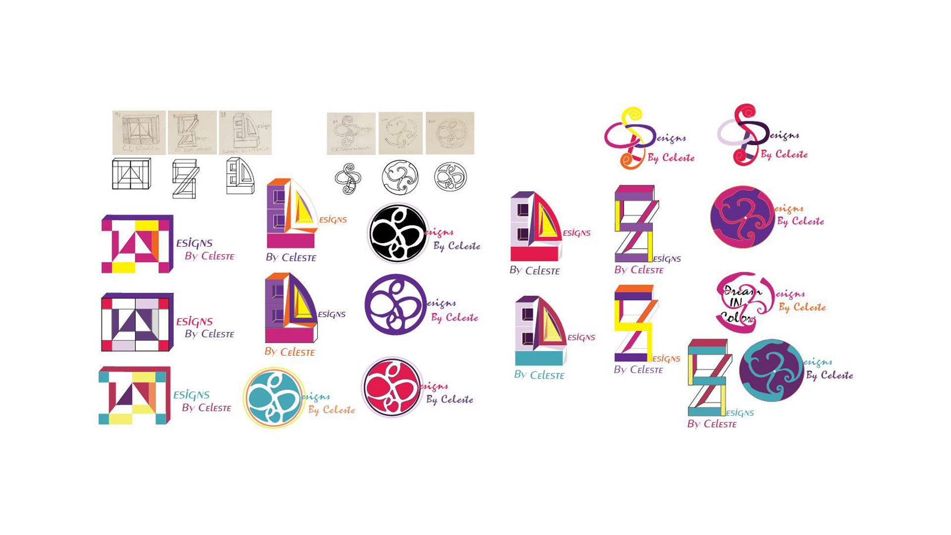
Logo Process
1 / 9

2 / 9

3 / 9

4 / 9

5 / 9

6 / 9

7 / 9

8 / 9

9 / 9

Photoshop, Illustrator and pencil sketches.
When I first started this project my original thought was to design a logo using the initials for my name and I later incorporated this idea into the new design ideas that included different elements. These elements came into play by asking myself what imagery might represent me as a person and why.
Finally I landed on two different design options as I could not decide on only one at that point in time. The first element I added is derived from the concept of what if I was a flower? I started by drawing tulips which are my favorite flowers. I think flowers can represent kindness and that is something that I want to be, kind. Moving from a literal take on this concept, where I just drew flowers, I later drew flowers in abstract as my initials. This lead to a design similar to Celtic Knot designs. I wanted to explore this more as I am Irish and I have always liked Celtic Knot designs. After researching more into the look and feel of Celtic Knots. I used that source inspiration to make two more renditions of the original design.
The second concept was a similar process of exploration. I started by drawing myself as renditions of mountains. I feel this represents me as I have overcome many obstacles in life. I’m going back to school in my forties, as a single mom of three, to pursue a new career path and that hasn’t been easy. I wanted to express my strength and perseverance. Just like option one I started out literally drawing mountains, but moved into designing something more abstract. What if my initials were mountains?
In the end I decided to go with the first option, the celtic flower, as I felt this was the logo that best fit me.
Visit my other sites at: